Motion Design That Respects the User
Good motion explains change and guides attention. It never makes people wait or feel unwell.

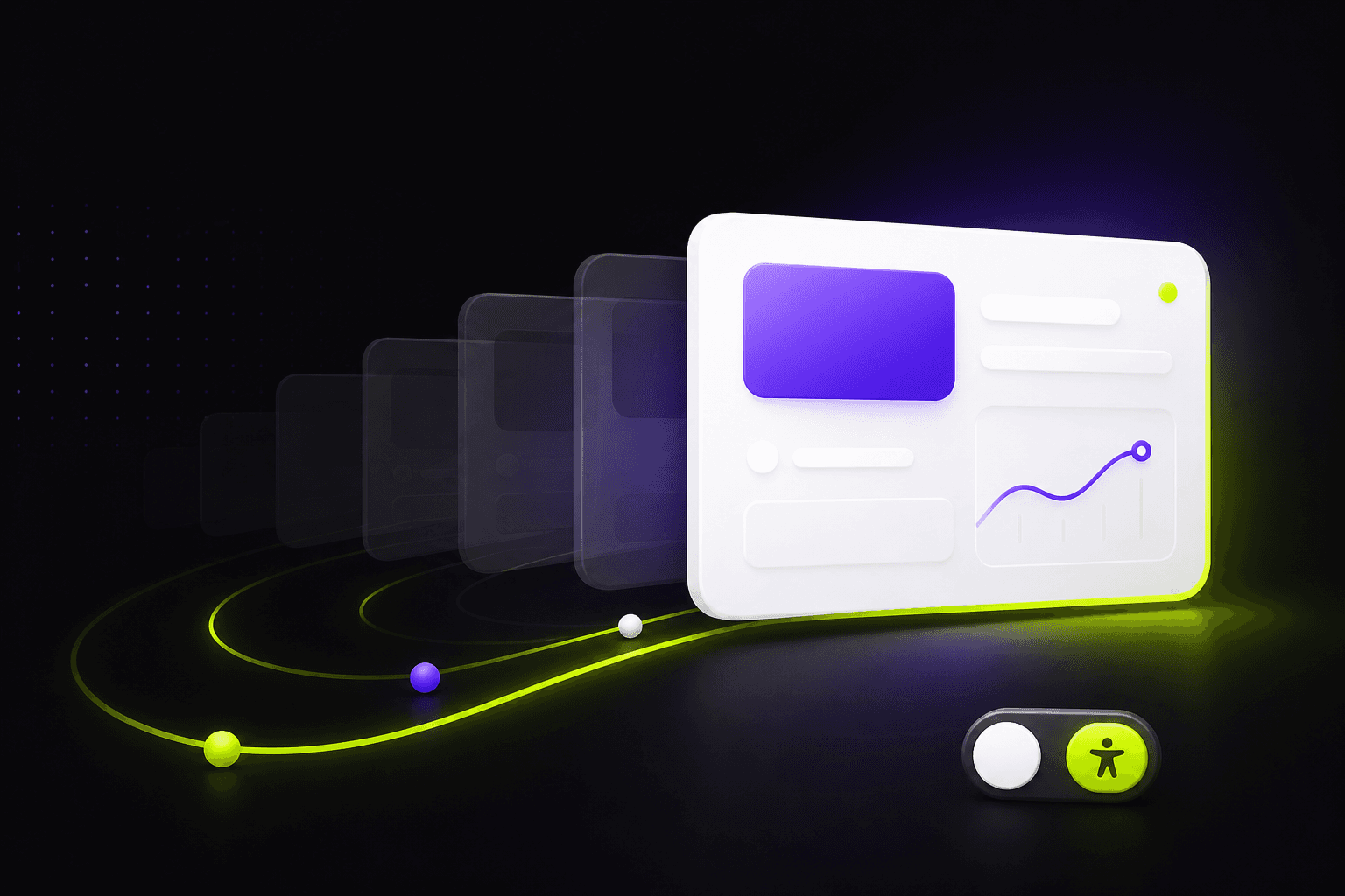
Animation is easy to add and easy to overdo. The difference between motion that feels premium and motion that feels annoying usually comes down to purpose. Every animation should answer a question: where did this come from, what changed, or where should I look next?
Keep durations short. Most interface transitions land between 150 and 300 milliseconds; longer animations are for large layout changes or deliberate storytelling moments such as a page reveal. Use easing that decelerates into place, because objects that stop abruptly feel mechanical.
Never block the user. Content should be readable and interactive as soon as possible, even while a decorative animation is still finishing. Avoid animating on every scroll event; reveal-once patterns feel calmer and cost less battery.
Respect the reduced-motion preference. Some users experience real discomfort from parallax and large movements. Provide a version with fades or no motion at all, and test it. This is a system setting, and honoring it is a mark of a well-built product.
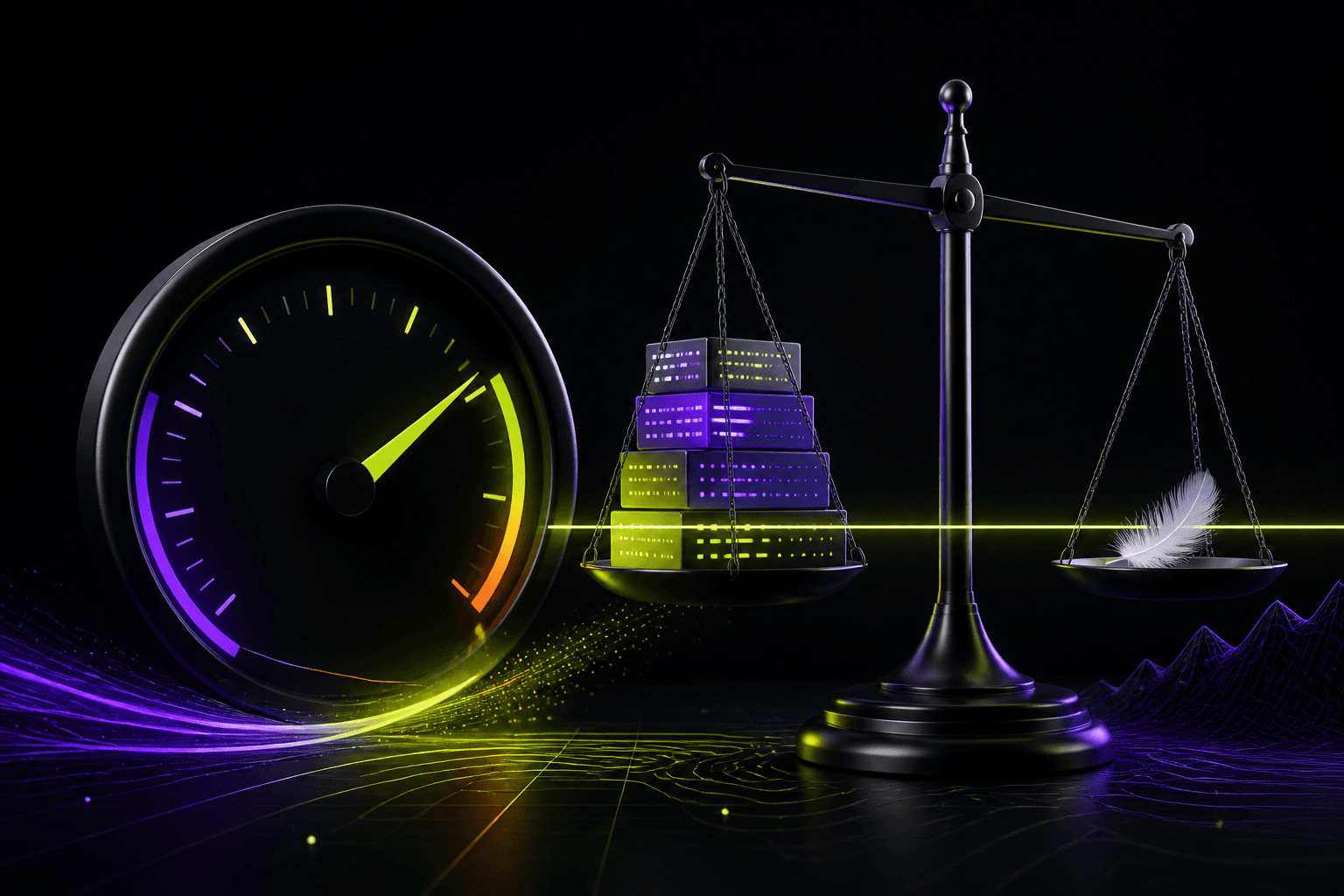
Finally, measure the cost. Animating layout properties such as height causes reflows; animating transform and opacity stays on the compositor and stays smooth on low-end devices. Beautiful motion that stutters is worse than no motion.